Styleguide
Design system documentation for Sahaja Yoga Deutschland.
Logo
Default (dark)
Inverted (white on dark)
File: /images/sy_logo_2026.svg
Sizing rule: Always use inline styles: style={{ height: '48px', width: 'auto' }}
Inversion: Use className="brightness-0 invert" for the white variant.
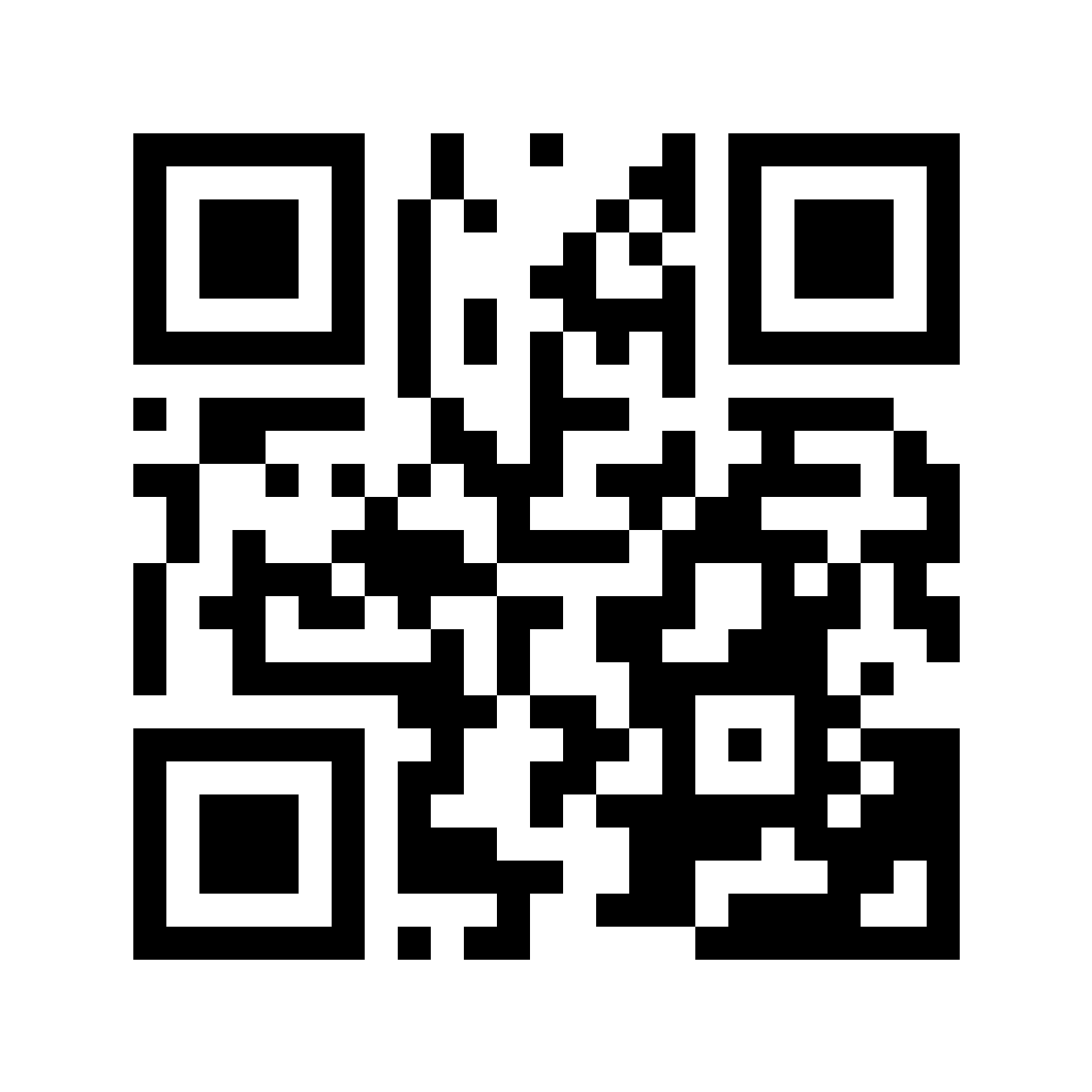
QR-Code
Verweist auf https://sahajayoga.de. SVG für Print (skaliert beliebig), PNG in 512 / 1024 / 2048 px für Social Media. Jeweils ohne und mit zentriertem SY-Logo.
Für kleinste Druckgrößen die Variante ohne Logo wählen (größte Scan-Reserve). Die Logo-Variante nutzt Fehlerkorrektur-Level H und bleibt zuverlässig scanbar.
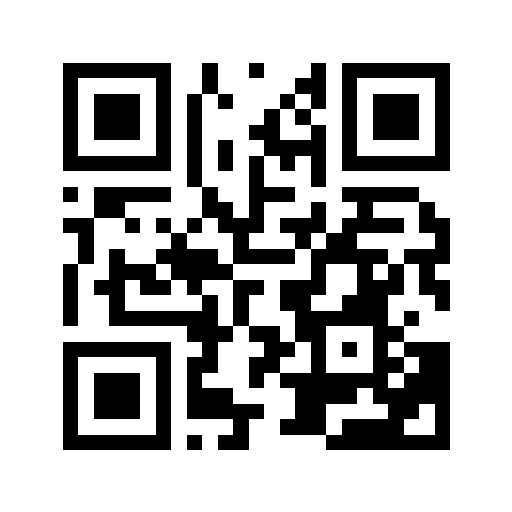
Schwarz auf Weiß
Universell, beste Scan-Sicherheit (Print, Handzettel)
Ohne Logo
Mit SY-Logo

Maroon auf Creme
Brand-Variante (maroon/creme)
Ohne Logo
Mit SY-Logo
Colors
All colors extracted from the hero image of Shri Mataji. Dot marks the primary shade for each palette.
Maroon
Primary brand color, CTAs, links, focus rings50
#fef2f3
100
#fde6e7
200
#fcd0d3
300
#f9a5ab
400
#f47481
500
#e94444
600
#d32f2f
700
#991f1f
800
#7d1a1a
900
#661616
Tailwind: maroon-50 ... maroon-900 · CSS: --color-maroon-700
Cream
Warm backgrounds, feature sections50
#fefdfb
100
#fef9f3
200
#fdf3e7
300
#f9e8d1
400
#f3d9b5
500
#e5c18a
600
#c9a26d
700
#a88350
800
#876640
900
#6b5133
Tailwind: cream-50 ... cream-900 · CSS: --color-cream-700
Sage
Nature/growth sections, secondary backgrounds50
#f7f8f5
100
#eef0e8
200
#dde2d1
300
#c5cfb3
400
#a9b88f
500
#8a9c6e
600
#6f7f55
700
#586545
800
#475339
900
#3a4430
Tailwind: sage-50 ... sage-900 · CSS: --color-sage-700
Rose
Feminine accents, soft highlights50
#fdf5f7
100
#fceaee
200
#f9d5de
300
#f4b3c2
400
#ed8ca2
500
#e06684
600
#ca4668
700
#a33651
800
#872e46
900
#6f293d
Tailwind: rose-50 ... rose-900 · CSS: --color-rose-700
Powder
Programme sections, cool contrast50
#f5f8fb
100
#ebf2f8
200
#d6e4f0
300
#b5d0e5
400
#8db7d8
500
#6a9cc9
600
#5382b8
700
#446ba1
800
#3a5984
900
#334a6b
Tailwind: powder-50 ... powder-900 · CSS: --color-powder-700
Earth
Text colors, grounding, dark backgrounds50
#f9f7f5
100
#f0ede8
200
#e0d9d0
300
#cbbfb0
400
#b3a08b
500
#9d856d
600
#8a6f5a
700
#735b4c
800
#5e4c40
900
#2d1f15
Tailwind: earth-50 ... earth-900 · CSS: --color-earth-700
--color-primary: #991f1f · --color-accent: #e94444 · --color-text: #2d1f15 · --color-text-light: #5e4c40Typography
Noto Serif (Headings)
Erkenne Dich Selbst
font-family: var(--font-noto-serif) · Weights: 400, 700
Noto SerifNoto Sans (Body)
Sahaja Yoga ist eine Meditationsmethode, die 1970 von Shri Mataji Nirmala Devi begründet wurde.
font-family: var(--font-noto-sans) · Weights: 400, 500, 600, 700
Noto SansFluid Type Scale
All sizes use clamp() for smooth scaling between viewports. No breakpoint jumps.
Line Heights
leading-tight
1.2
Headings
leading-snug
1.4
Subheadings
leading-normal
1.6
Short text
leading-relaxed
1.8
Body text
Spacing
Standard Tailwind spacing (4px base unit). Baseline rhythm: 1.8rem. Grid unit: 8px.
Grid & Layout
Container
max-w-7xl (1280px) with responsive padding:
px-4 (16px) / sm:px-6 (24px) / lg:px-8 (32px)
Page width
Content capped at max-w-container (1240px).
Extended in tailwind.config.ts
Two-column pattern
grid grid-cols-1 lg:grid-cols-2 gap-8
Stacks on mobile, side-by-side at lg (1024px)
Hero height
height: min(100vh, 850px) for hero sections.
Section caps use min(100vh, 700px). Never mix min-height with max-height.
Viewports
sm
640px
Mobile landscape / small tablet
md
768px
Tablet portrait
lg
1024px
Desktop (mobile/desktop switch)
xl
1280px
Large desktop
The primary mobile/desktop switch happens at lg (1024px). Fluid typography scales continuously via clamp(), no breakpoint jumps.
Components
Button
components/ui/Button.tsx supports 4 variants and 3 sizes. Uses inline styles for Safari compatibility. Focus ring via Tailwind: focus:ring-4 focus:ring-maroon-200 focus:ring-offset-2.
Variants
Sizes
Download Buttons
variant (primary | outline | ghost | inverted) · size (sm | md | lg) · href (renders as Link) · onClick (renders as button)Focus Ring Pattern
All interactive elements use focus:outline-none focus:ring-4 focus:ring-maroon-200 focus:ring-offset-2. This provides a visible, high-contrast focus indicator for keyboard navigation.
Architecture
Stack
- Next.js 16 (App Router, SSG)
- Tailwind CSS v4
- Sanity CMS (project: mkdh9rck)
- TypeScript
Safari Rule
Tailwind v4 classes frequently fail in Safari. Use inline styles for all critical layout, colors, sizing, and transforms. Tailwind is fine for hover/focus states and progressive-enhancement classes.
Key Directories
- app/ — pages & routing
- app/[slug]/ — SSG dynamic routes
- components/layout/ — Header, Footer
- components/sections/ — Hero, CoverBlock, ContentBlock
- components/ui/ — Button, ScrollReveal
- lib/ — Sanity client, helpers
Routing
Homepage is hardcoded in app/page.tsx. All Sanity static pages use app/[slug]/page.tsx via generateStaticParams. City pages at app/programme/[slug]/page.tsx. Mediathek at app/mediathek/page.tsx.